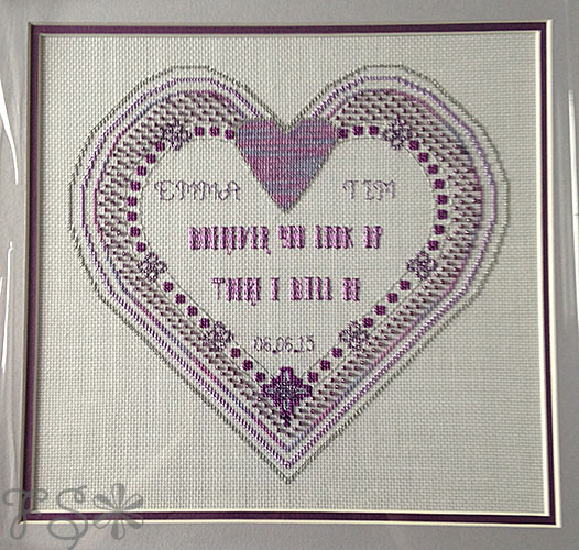
Emma and Tim are very good friends who got married in 2015. Emma made the elegant invitations herself and this was the central design.
Initially I bought a pattern from the internet to get the concentric hearts plotted but I changed so much of it that I really feel that the finished product is ultimately my own design. The original pattern looked like this:
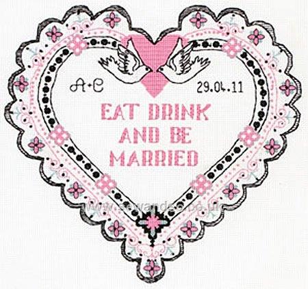
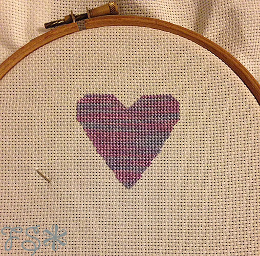
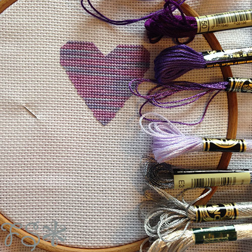
I removed the doves and filled in the solid heart beneath them. I also omitted the outer scalloped edge border and I changed the phrase in the middle of the design. The design evolved as I stitched rather than having a completed pattern to begin with. This is not a usual occurrence with me as it tends to increase the amount of unstitching/restitching if a part of the design doesn’t turn out as I envisaged. I stitched on 16 count white aida fabric and used a hand-dyed variegated purple/blue thread (Monkey Mia by Dinky Dyes) to stitch the solid heart.
Next I carefully matched purple and silver DMC thread colours to the variegated thread and to the original invitation to complete the rest of the design.
I then stitched the only other design element that I took from the original pattern that I had bought using a darker purple and a metallic purple thread.
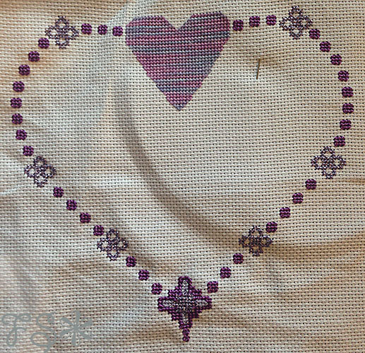
And I began to add further heart shapes to encircle this one using more of the variegated thread, a lighter lilac colour with a satin finish and a metallic silver.
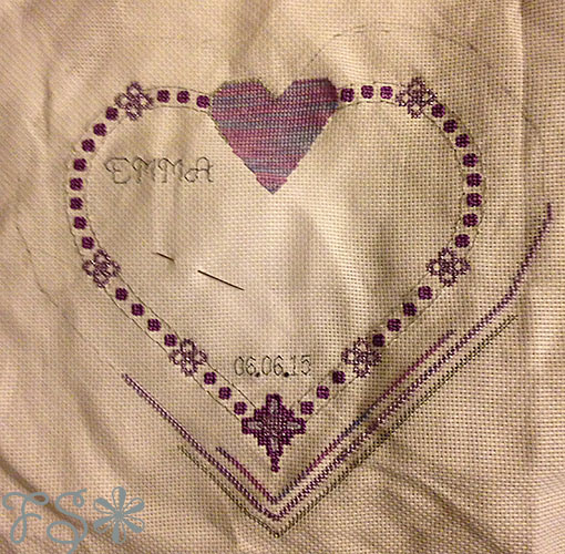
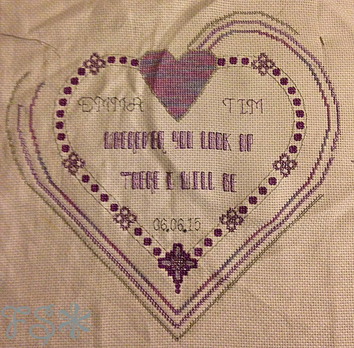
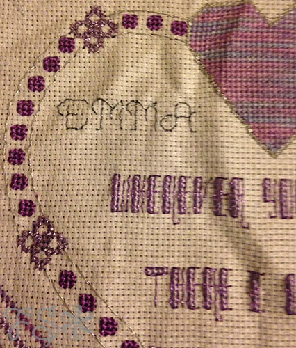
Then came the text; the names of the bride and groom in the top part of the design, the date of the wedding at the very bottom of the design and the last line of one of their readings, “Whenever you look up there I will be”, in the centre. (The groom at this point knew that I was creating a sampler and told me which readings they were having so that I could pick something unique to them though he still had no idea what the design looked like).
The colour I chose for the main text was the same satin lilac that was used for one of the outer heart shapes and a light metallic purple for backstitch to give an extra sparkle. The eagle-eyed among you will notice that at this point the bride’s name is in a metallic charcoal and the groom’s name is in the metallic purple that was used for the phrase in the centre. I eventually decided that the purple was a better match to the overall design and so unpicked the charcoal and restitched with the purple.
Below is a close-up of the work.
I then hand washed and gently ironed the piece to remove the creases made by the embroidery hoop that I use to keep an even tension while stitching and finally I added lots of purple seed beads to fill in the gap between the first heart shape and the outer ones. The aim was to mimic the purple mesh that Emma had used in the invitation design.
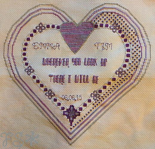
When the beads completely covered this gap, I took the finished piece to a professional framer who stretched the fabric and framed it with a purple and silver double mount and a silver coloured frame.